Very funny and interesting story in the New York Times. Vending machines being ubiquitous in Japan nothing better than a "vending machine dress" to become part of the cityscape. Note the feet of the "vending machine" on the right.
Showing posts with label design. Show all posts
Showing posts with label design. Show all posts
Monday, October 22, 2007
urban camouflage
Wednesday, July 04, 2007
apple evolution
Take a look at this chart that details the evolution of Apple product design from 1976 to 2007. Follow the link to see a larger image. (link via Guy Kawazaki)
Tuesday, June 12, 2007
jane jetson's dress
Shape-changing dresses by Hussein Chalayan.
 Watch the YouTube video here.
 They remind me of Jane Jetson's dresses. Really cool.
 (via infosthetics)
Thursday, May 31, 2007
design for the other 90%
This is one of the objects that are on display at the "Design For The Other 90%" exhibition at the Cooper-Hewitt Museum, in New York City. It's a 20-gallon rolling drum, designed to carry water over long distances. In many places, people live kilometers from clean water sources. This drum makes life much easier (the usual way is to carry large containers of water on top of the head). Reference:
MACNEIL JR., DONALD G. "Design That Solves Problems for the World's Poor", The New York Times, May 29, 2007. (here)
Wednesday, May 02, 2007
helvetica, the movie
 I just needed to have this poster in the blog: Helvetica, the documentary (via infosthetics and designobserver). See the YouTube trailer here.
Friday, April 27, 2007
stand umbrella

Tuesday, April 24, 2007
is yahoo trying to be more like google?
It's not exactly a secret that Yahoo! envies Google's success. This sentiment has usually been confined to the business arena, as both companies battle for internet's advertising dollars.
However I think this is the first time Yahoo! betrayed that sentiment so publicly. The other day I noticed Yahoo! playing up with their logo, Google-style. See below a couple of pictures of their animated logo: a (modern) windmill that lights up a (green) light bulb, before transforming into their traditional logo.
Starts like this...
...ends up like this. As Google's, it was for a limited time only. Last time I checked, it wasn't there anymore.
Wednesday, March 28, 2007
google acquires trendalyzer
Just a note following-up on the theme of my latest post.
Google's recent acquisition of Gapminder's Trendalyzer software only highlights the importance of data visualization. Gapminder co-founder, Hans Rosling, of course, is well known for his 2006 TED presentation where he showed how data can be presented in a more clear and visually arresting way (and he's becoming famous for being a sword swallower as well!).
Google's Marissa Mayer, says that, "like Google, Gapminder strives to make information more useful, and Trendalyzer will improve any function or application in which data might be better visualized...We hope (to make) it freely available to any and all users capable of thinking outside the X and Y axes".
Google has already made available a beta-version, here.  I guess this acquisition makes a strong case for the importance of "information aesthetics" nowadays. As we get overloaded with information, "the problem", as Mr. Rosling aptly said in his TED presentation, "is not ignorance, it is preconceived ideas".
how cool is your name?
Very interesting piece on PingMag about "Infoesthetics: the beauty of data visualization". There are several examples, but the one that caught my attention was this one: The Name Voyager. It's an interactive tool showing the popularity rank of baby names from 1880 to 2005. As you can see below, "Nelson" used to be a popular name... around 1890! The accompanying blog, by Laura Wattenberg, author of "The Baby Name Wizard", offers a fascinating look into baby name trends and pop culture influence.
Tuesday, March 20, 2007
time's new design
The latest issue of Time magazine brings a new design developed by Pentagram's Luke Hayman, Time managing editor Richard Stengel and art director Arthur Hochstein. Below is the table of contents page and the Briefing section.
 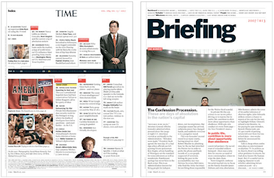 More pages and an overview of the new design project at Pentagram. There's also an interesting note at boingboing about the tear on Reagan's face.
Thursday, March 08, 2007
ted 2007
The 2007 TED Conference starts in Monterey, California. You can follow some of the action here. And wait for the presentations to be available here, sometime in the future. In the meantime, you can watch Wired Editor-at-Large Kevin Kelly, talking about the evolution of biology and technology (duration: 20:39), on TED 2005, below (or download it here).
Monday, March 05, 2007
water cube
The spectacular "Water Cube", venue of the swimming and diving competitions in the 2008 Beijing Olympics, had its outside membrane structure completed last December.
Of all the new stadiums being built for the Games, I personally find this the most striking one.
Below, a view of the project... ... and the actual building below.
 522 days to go.
Thursday, February 08, 2007
ali rap
Read 'Ali Rap', a book edited and beautifully designed by George Lois, and published by Taschen and ESPN. Actually I flipped through it in less than one hour, so fascinating the book is. But more than just a book about Ali's famous wisecracks and rhymes, which are geniuses by themselves, the book takes the reader to a journey through America's recent history. And all that designed by George Lois. It doesn't get any better than this. Some excerpts from the book:
"This is the legend of Muhammad Ali,
The greatest fighter that ever will be.
He talks a great deal and brags, indeed,
Of a powerful punch and blinding speed.
Ali's got a left, Ali's got a right,
If he hits you once, you're asleep for the night."
"I'm so fast that last night I turned the light switch off in my bedroom... and I was in bed before the room was dark."
On a return to a young, terminally ill cancer patient:
Ali: "I told you I was gonna whup George Foreman. Well, I'm back from Zaire and I did whup George Foreman, and now you're gonna whup cancer".
Boy: "No, Muhammad. I'm going to meet God. And I'm going to tell Him I know you."
Wednesday, February 07, 2007
beijing olympics pictograms


 In the official website you get to see the evolution of the design since the 1964 Tokyo Olympics.
Friday, February 02, 2007
design conscious singaporeans
There's an interesting ongoing campaign in Singapore called "10 Touchpoints. Better Living. Better Design", promoted by the Design Singapore Council, which urges Singaporeans to vote for the worst designed everyday items in the island. At the end of the campaign, the top-10 most voted items are going to be redesigned.
That's an interesting way to raise awareness about the importance of design in everyday life. We all have complaints about mundane things that we believe could be better designed and yet, most of the times, we don't bother to voice our opinions. Well, here's our chance. Nominations can be made until Feb. 14. Votes can be cast until Feb. 27.
So far, some of the most voted items are:
Ugly drains and canals, poorly designed bus handle, lack of an island-wide cycling lane (this one really deserves a vote), better "keep left" signs on the subway escalator (that's really interesting, this being a former British colony. In London you're supposed to stay on your right). Visit the campaign's website and see more examples (and cast your vote).
Tuesday, January 09, 2007
iPod-inspired architecture
Dubai, which already has a collection of the world's most daring constructions, has announced the plans to build the iPad, an iPod-inspired, 23-storey building, designed by Hong Kong-based consultancy James Law Cybertecture. "The tower will sit atop a docking station angled at six degrees to give the exact look" (via MacDailyNews.com). See picture below (via skyscrapercity.com). Yet another "i-something" brand, but this at least makes sense.
Wednesday, November 15, 2006
design that makes a difference
I found this via Dany (thanks Dany).
In the aftermath of Hurricane Katrina, many people found themselves living in FEMA trailers, offered as a practical solution for temporary housing. There are currently approximately 99,000 of these trailers in Louisiana and Mississippi. Experience shows that these temporary shelters however tend to become permanent as people struggle to put their lives back on track. Many years after Hurricane Andrew hit Florida, there are still people living in trailers there. Besides, there's the decrease in property value and the increase in criminality in areas where these trailers stay for too long, a decline in self-worth perhaps driving urban decay. A trailer can be a practical, quick solution, but there's a sense of impermanence about it. You don't build a community back to normal life if most people are living in them. As one trailer resident says, "Have you been in a FEMA trailer? It's like living on a navy ship."
It was thinking about an alternative to the trailer that designer Marianne Cusato came up with this cute cottage idea.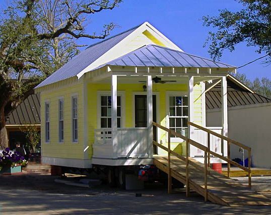
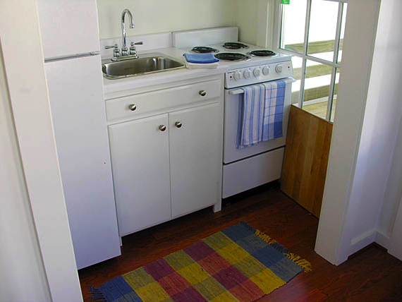
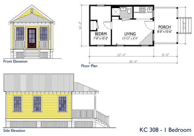
She says she "wanted to create a more dignified version of the FEMA trailer". Named Katrina Cottage, it's about the same size as the trailer and it costs about the same as well, about US$ 35,000 (there are other larger, more expensive models now). But the great thing about it is that it brings a whole different feel to a devastated area. The cottage has a creole-inspired design that evokes a nice homey feeling to it. It even has a front porch, opening the possibility for residents to meet neighbors and passersby. It's also designed to allow for future expansions.
Recently, Ms. Cusato was awarded the Smithsonian's Cooper-Hewitt, National Design Museum, People's Design Award.
References:
Fornoff, Susan. The Little House That Roared. San Francisco Chronicle. March 4, 2006. (here)
Perry, Rex. Katrina Cottages. Cottage Living. July/August 2006. (here)
Rybczynski, Witold. The Katrina Cottage. Slate. March 31, 2006. (here)
Subscribe to:
Posts (Atom)
 Subscribe to this blog's feed